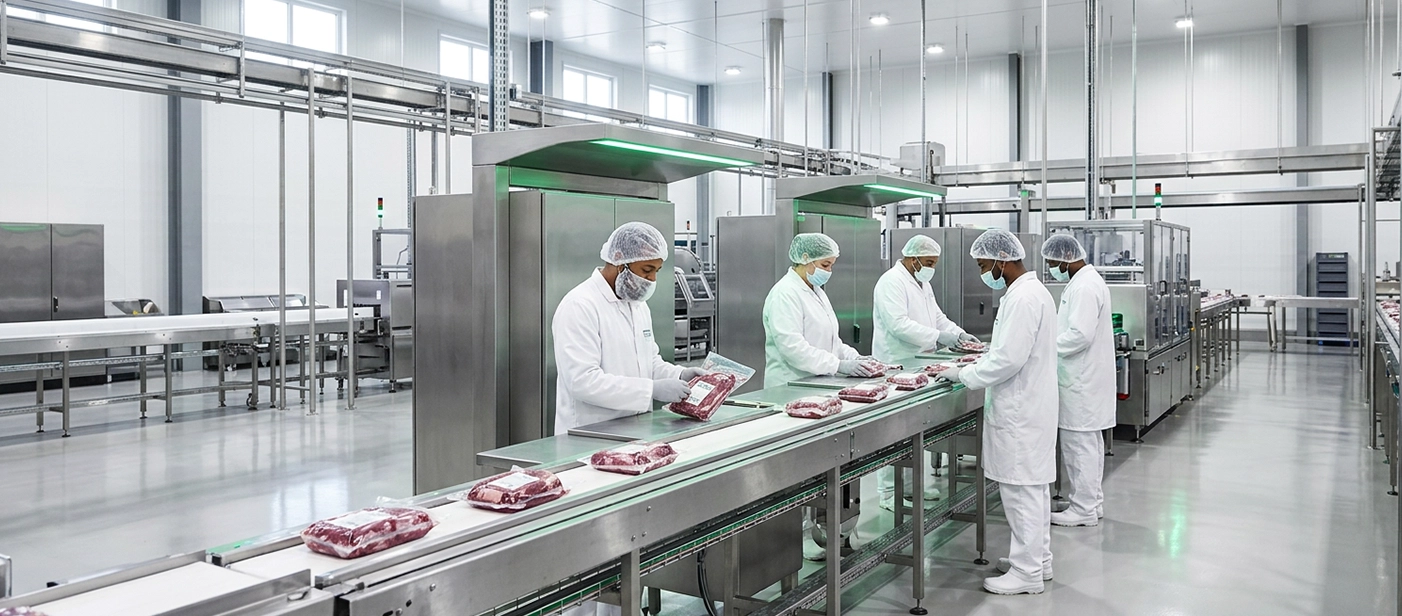
Agriculture & Grains
Soybeans, corn, cotton, sorghum, fresh and dried fruits from Brazil and Uzbekistan.
View category
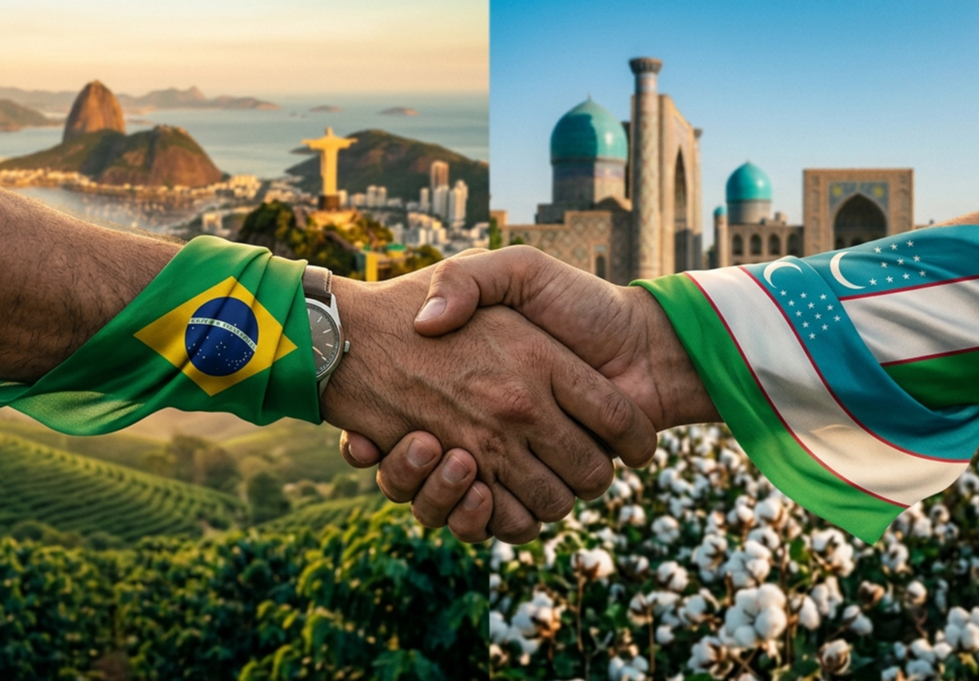
Brazil is Latin America's largest economy and one of the world's top exporters of food, energy, and industrial goods. Uzbekistan is Central Asia's fastest-growing market and the gateway to a region of over 75 million consumers. We connect the two — handling sourcing, negotiation, logistics, and compliance so your goods move without friction.
Eight categories. Two origins. One point of contact. Every product is sourced from verified suppliers,
quality-checked, and shipped with complete export documentation.

3-minute read

3-minute read

2-minute read
The Brazil–Uzbekistan corridor is one of the youngest and most promising trade routes in the world. Here is what moves — and where the opportunities are.
 Halal-certified Brazilian beef and poultry Sugar, coffee, soybeans, corn, and feed Juice concentrates and processed foods
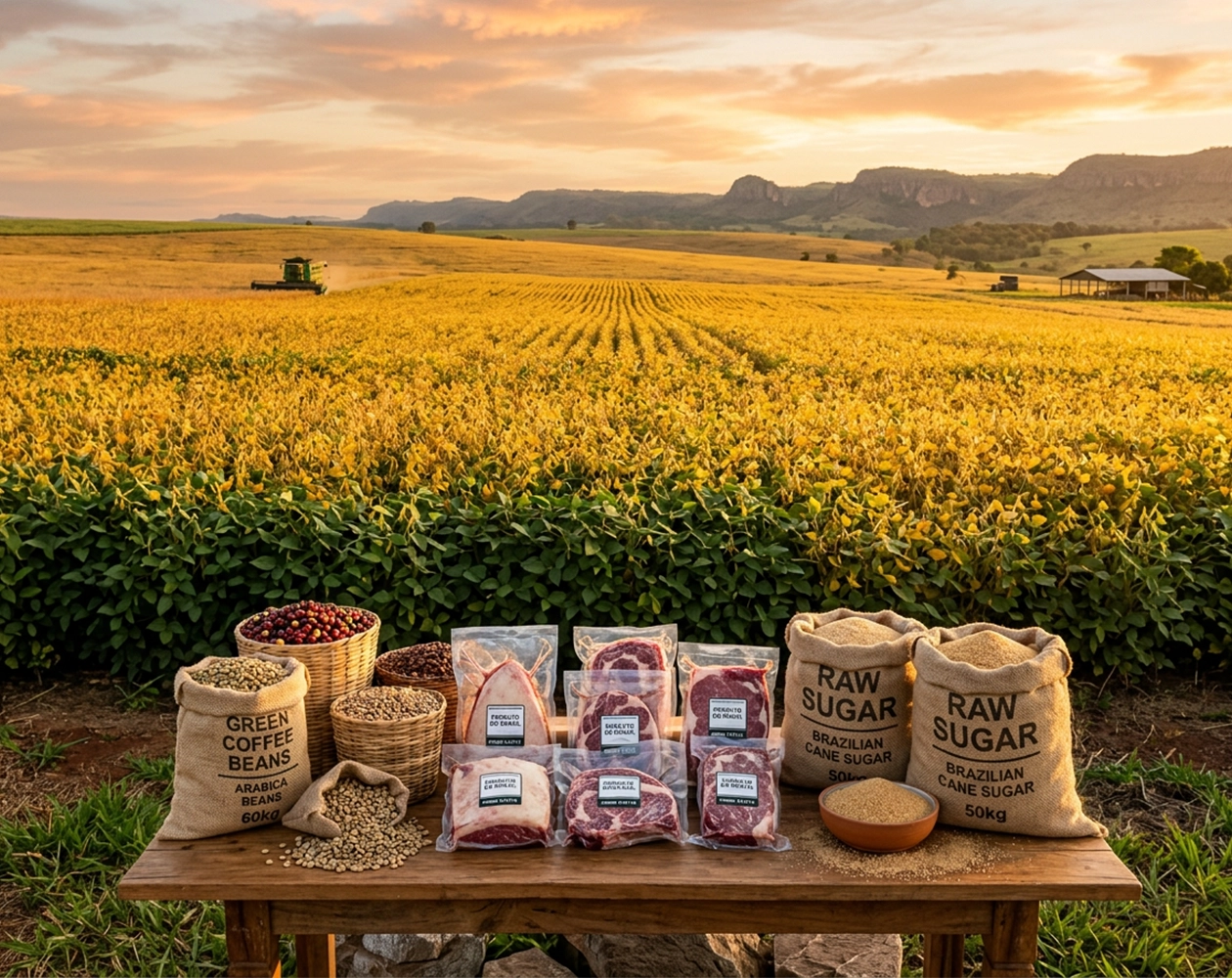
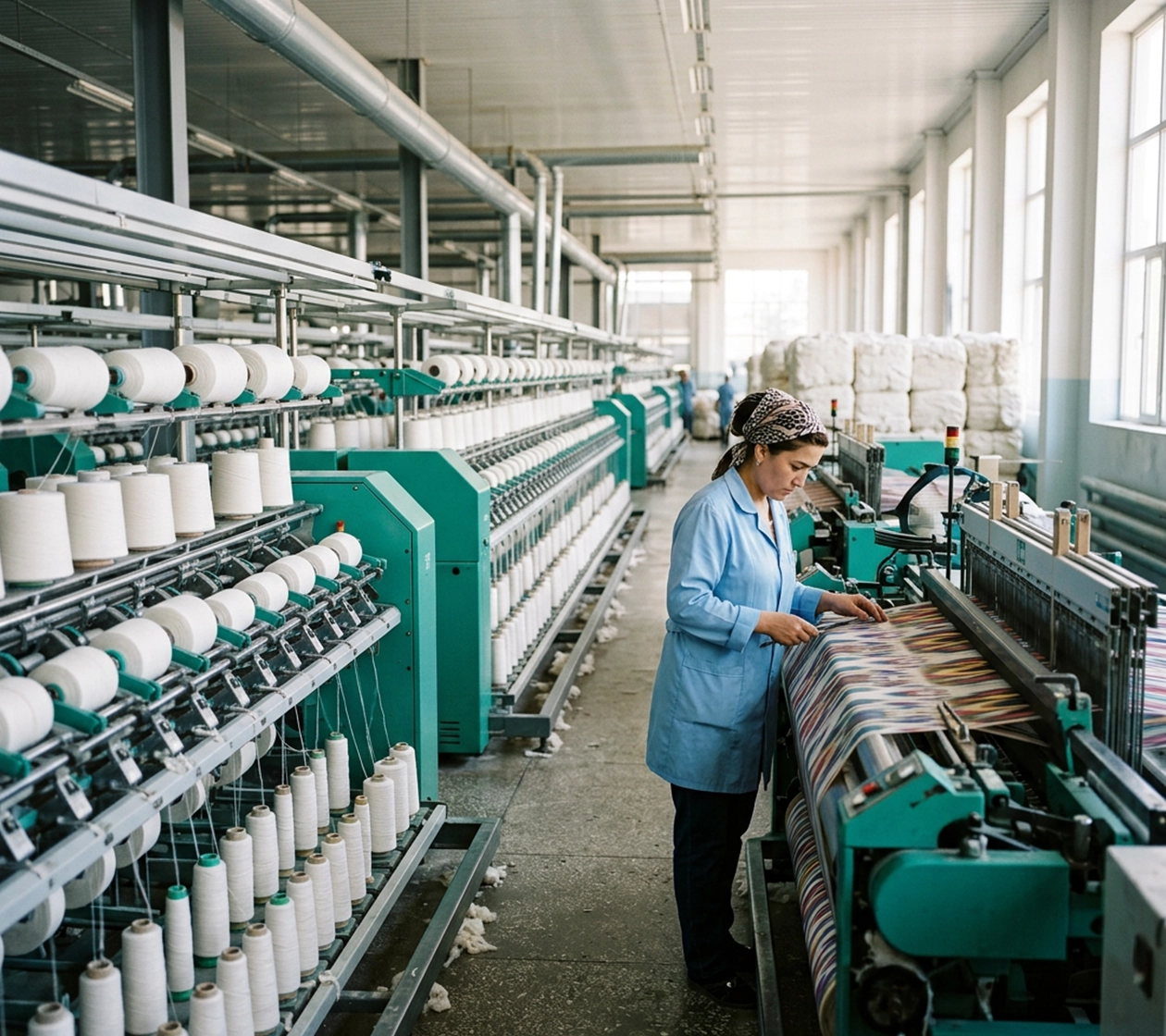 Cotton, yarn, fabric, and finished garments Nitrogen fertilizers for Brazilian agribusiness Premium dried fruits and minerals Ocean freight from Brazilian ports Multimodal transit via Middle Corridor Warehousing and customs on both ends
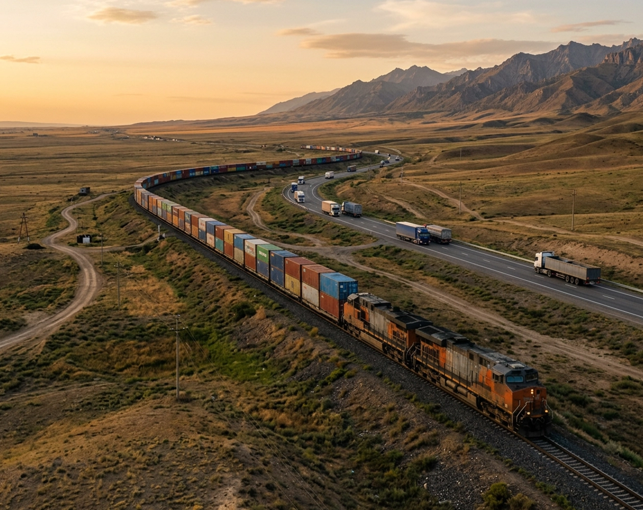
We know both markets from the inside — Brazilian export regulations and Central Asian import requirements, in one team.

From first inquiry to final delivery: sourcing, quality control, documentation, customs, and logistics under one roof.